Rough Draft
I was assigned a two-week project in my visual design class where we take a magazine article and create a three-page layout, which included a spread (a double page design). We could choose any article from LDS.org or from our school newspaper, The Scroll, at Brigham Young University-Idaho. I decided to use a blog post from LDS.org which you can see here —> Magazine Article Link
We had several different requirements to work with but our main purpose was to show our understanding of the principles of design, typography, color, and photography.
Color
Here are all the color codes I used. I will later Explain them and where they fit in my project.
Turquoise # 1FCFDA
Orange-Yellow #CBB46F
Rich Electric Blue #0080A4 Quote
White #FFFFFF Titles
Black #000000 Paragraph
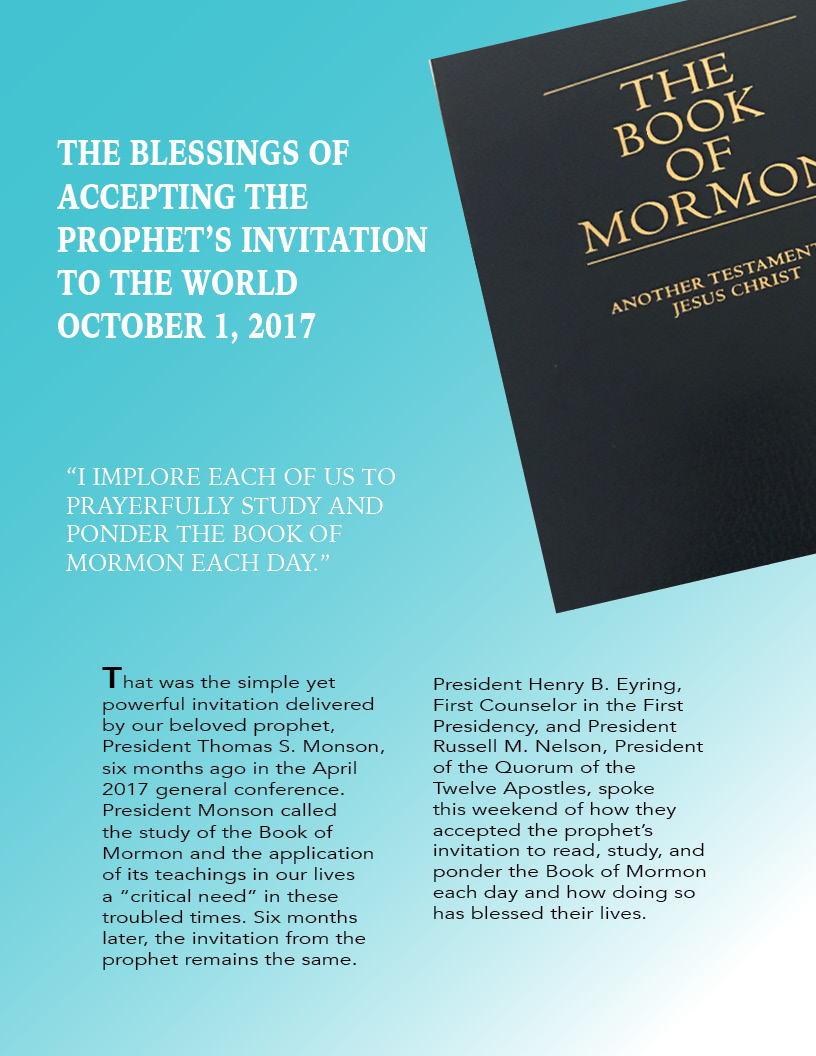
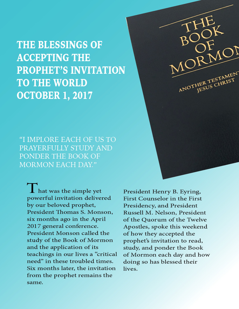
I am a big fan of blue and decided on the turquoise as my background before anything. I didn’t want the blue to be so plain so I decided to add a gradient with white. I changed the angles of the white part to be on the opposite corners of the shapes or picture on the first page. I really liked how it looked and decided on white as my font color for the titles on the first page.
I know that blue and gold are complementary colors but I didn’t want a plain yellow to be my other color, so I played around in the yellow until I got this sort of gold color. I felt it looked great as my accent color and used it for my corner shapes. I also wanted it to be complementary to my pictureon the first page, which is a book with gold lettering and blue leather.
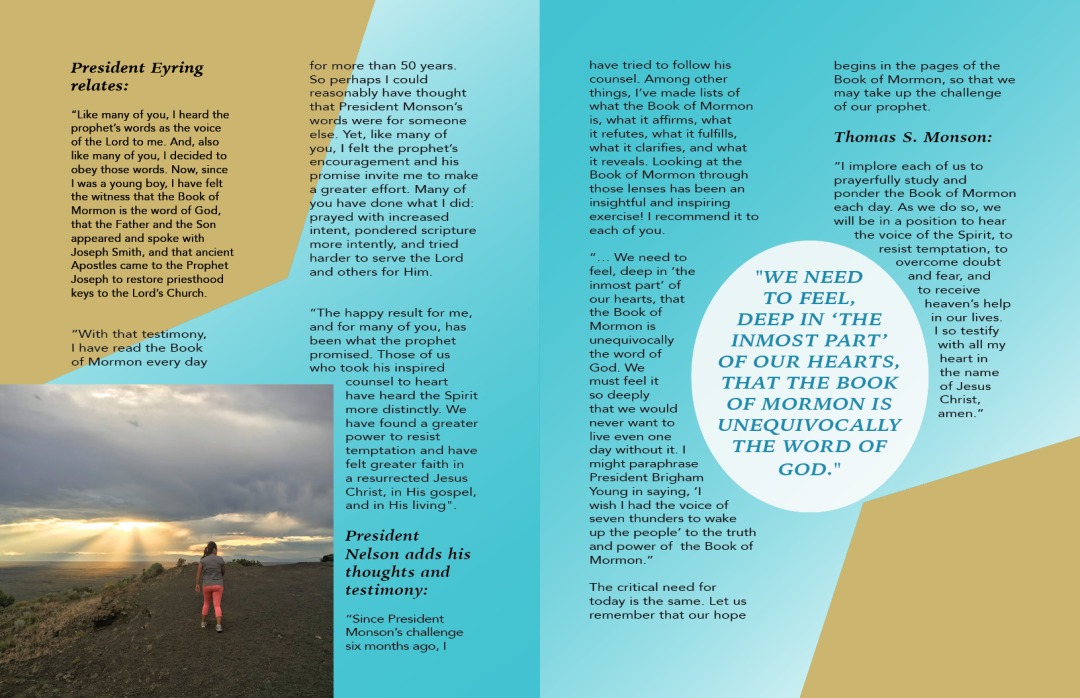
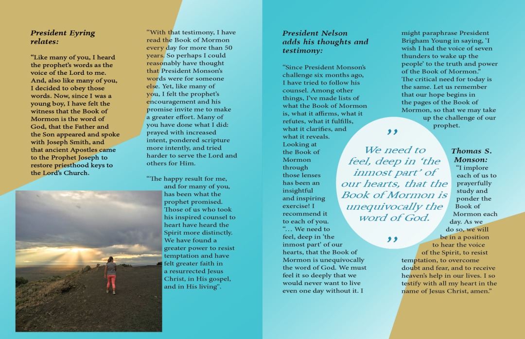
I decided for a quote I wanted to emphasize to use not just black or turquoise. I decided on an electric blue. It fits with the blue theme but isn’t lost in the background. It gives it enough contrast but a good compliment to the blue. I used a white background to make it stand out a bit more.
Photography
I wanted to use photos that emphasized the theme but didn’t distract. For the first photo, I went to a mountain here in Idaho (where I am currently studying)called R Mountain. I had my friend take the photo of me at sunset. I felt this photo was best because of colors more than anything. I think it was a beautiful photo and used rule of thirds. I had to cut out a bit of the photo for the final project but it turned out great overall.
For the second photo, I wanted to truly emphasize on the actual topic. The magazine article was talking about and a book called the Book of Mormon, which is used in the Church of Jesus Christ of Latter-day Saints. I took a simple photo of it on my bed but then cropped out everything except the book to make it look cleaner. I didn’t want it to be in the background, so opted to have it in the corner, almost floating.
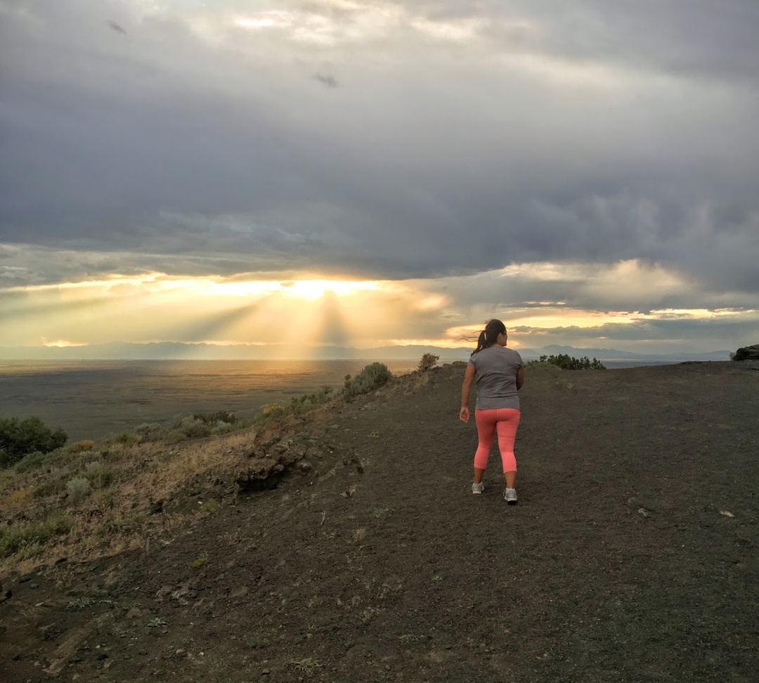
Photo Cred: Natalia Perez
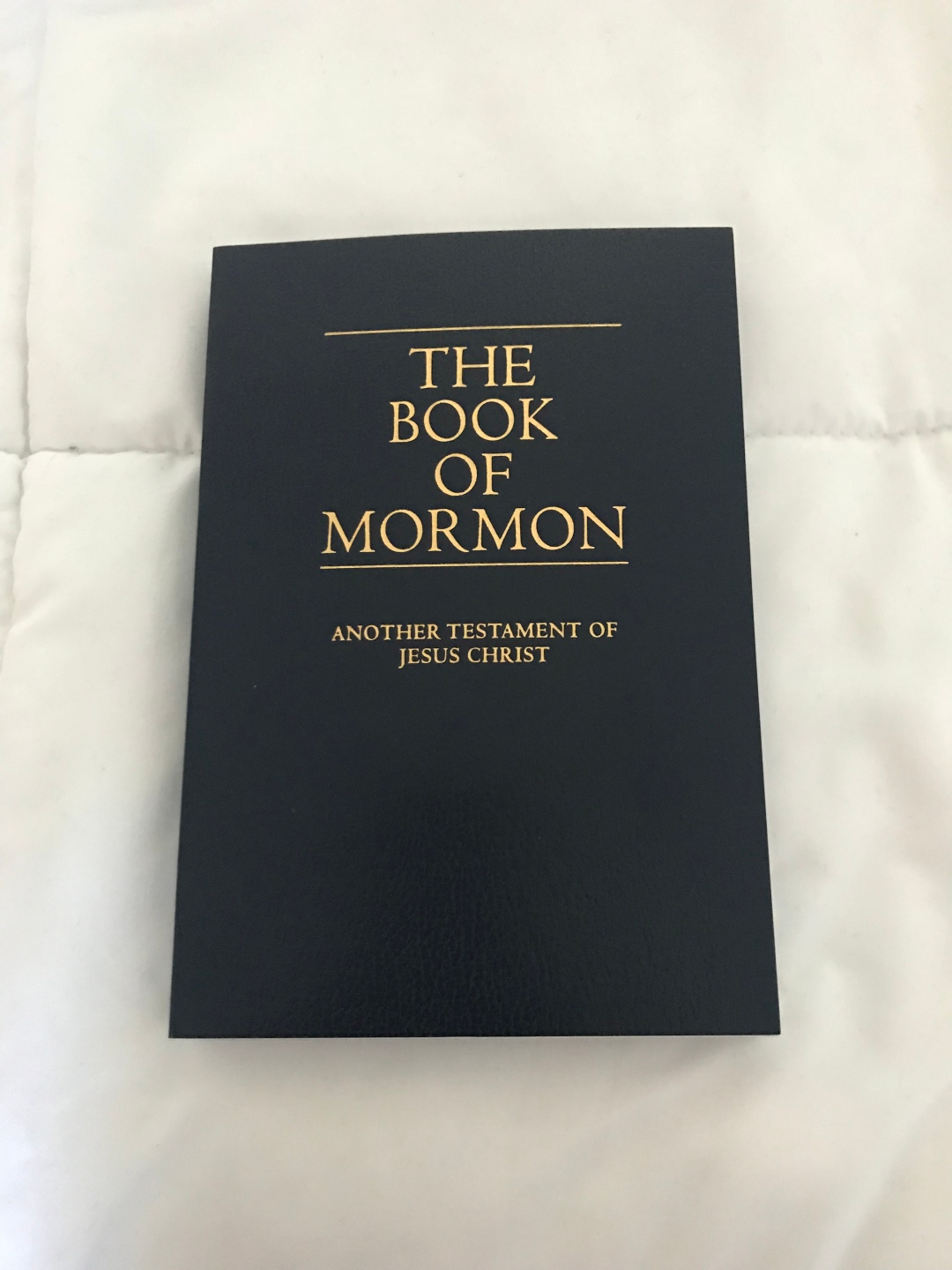
Photo Cred: Natalia Perez
Typography
Iowan Old Style titles
Iowan Old Style Bold Italic
Iowan Old Style Roman
Minion Pro
Avenir
These are the different types of font I used in my project. I didn’t use very many, I wanted to keep it all in the same family. I used Iowan Old Style for all the titles and quotes. I decided to use different types of this font and used the Roman Styling on the pull quote, to make it look very different but still be the same. I really liked how my title looked with the plain Iowan Old Style. The bold italic styling I used for the bolded subheading, the ones at the top of the columns. I didn’t want to change the styling completely for these so opted for the italic bold.
For the body of the article, I used Minion Pro in the rough draft. For the final draft, I opted for a sans serif font called Avenir. I like the slight contrast of the two fonts and opted for this. I liked how easy it was to read, and the look in the article.
Conclusion
This is the final version of the magazine spread project. I decided to change several things and am glad about the final spread. It was indeed a great learning experience about Indesign.