
 Tetherow Golf course.
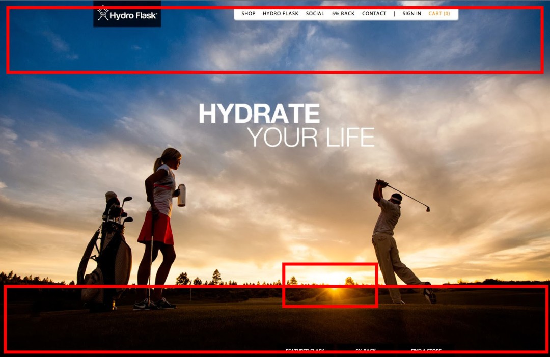
In this blog post, I focused on the ad ‘Hydrate your Life’ by the water bottle company Hydroflask. We will be reviewing basic principles of design (contrast, repetition, alignment, proximity, and color) we see in this ad.
Intro: Hydro Flask is an innovative company that started in 2009 with a dream to end lukewarm water consumption. They started in 2009 by creating a vacuum sealed double insulated water bottle. The product became hugely successful with over 1 million dollars in sales by 2011. They continue to expand their product lineup, from the simple water bottle that started it all to food and wine containers. Based out of Oregon, the company decided to make its mark in the world and expanded to Europe in 2015 and planned to go worldwide by the end of 2016.
Alignment:
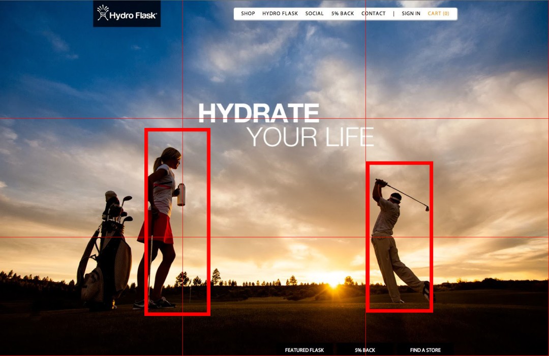
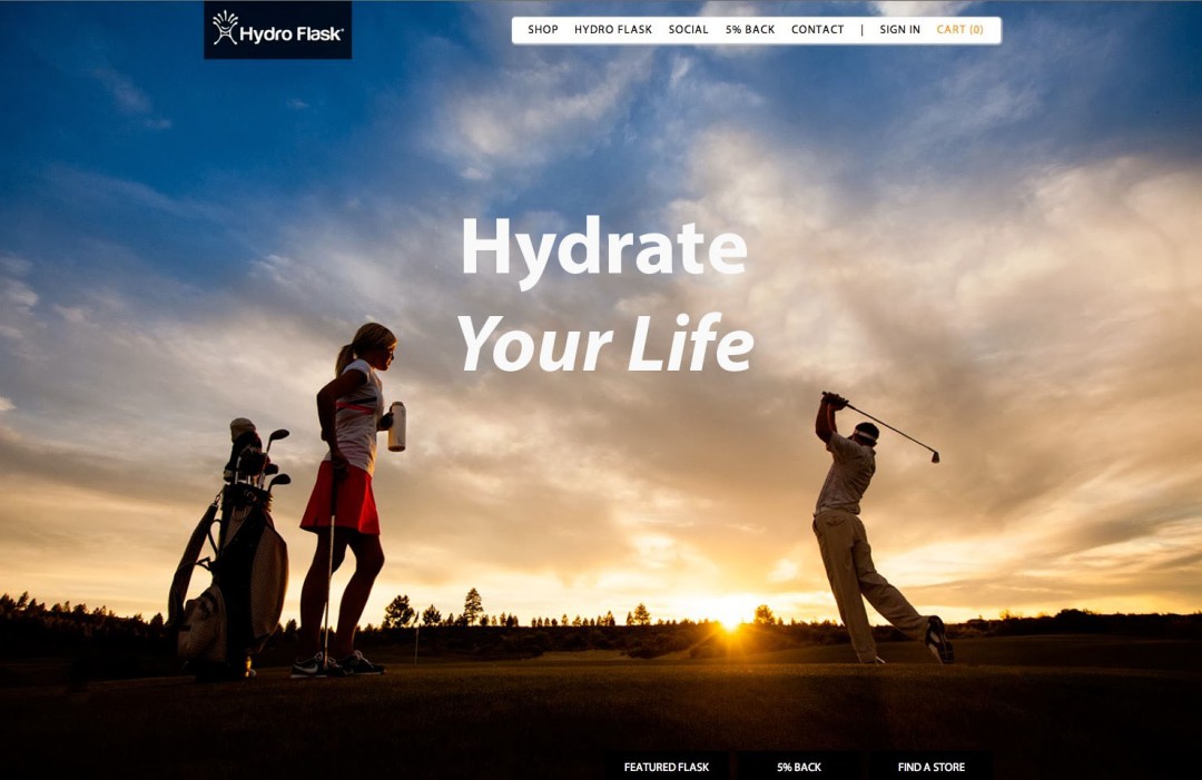
In the ad, you can see there are two people on opposing sides spaced evenly. I drew up the lines to demonstrate their closeness to the rule of thirds. The title of the ad is also located in the top center, almost directly on the horizontal line for the rule of thirds. The title is used with center alignment but with a twist, it has a slight slant to spice it up. I feel as though it would have been a tragedy if they opted for plain, even centered alignment. This is way more tasteful and attractive to the eye. I’ve included a sample of what it would look like if it were straight and centered. It makes it harder to take it seriously in my opinion.
Proximity:
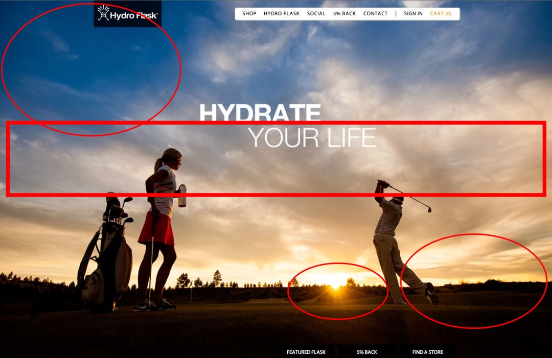
The words on the ad are all placed separately but together. The wording that has links to contact the company and its website are all placed together in the same box. I thought it strange at first not having any lines between them but see there is enough space to prove that they are in fact separate but together. The title is centered without any space below to show they are meant to be read together. The logo is to the side but close enough to know who is selling the product. I feel as though they could have done a left or right alignment instead of an off-center alignment, making it more concise and easier to see the sunset.

Color:
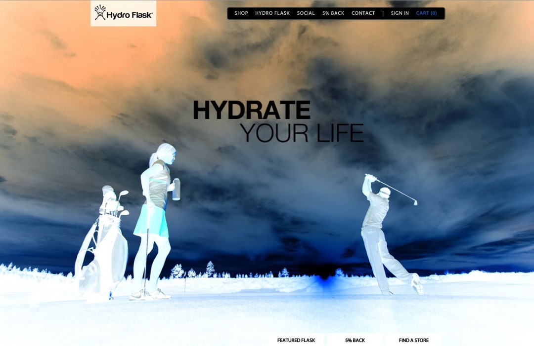
In this ad, we see two very distinct colors, orange and blue. The darker part of the two in opposing corners (bottom right and top left). They mutually blend in the center where they meet. Knowing that blue and orange are complementary colors, we see that they don’t necessarily fight each other for attention but naturally come together. If you invert the ad you can see the opposite colors in the corners.
Contrast:
For contrast, I focused on the darkness and light in the top and bottom. The top part of the ad is bright and cheery with a mix of neutral. But as your eyes move towards the bottom half of the ad you can see only darkness. It is hard to tell what exactly they are standing on because of how dark it is. The light from the sunset is blinding and calls for your attention amidst the darkness. I like that direct contrast of light and dark and how appealing to the eys it can be. As we discussed earlier there is a definite contrast of colors but becoming blended in the center. This makes the ad easier to digest.
Repetition:
There is a same use of font with the title. They are both the same style but the with a slight difference. The top is a bold type while the bottom is a bold italic, making it thinner but practically the same. There is a slight repetition of color on the bottom half. The orange is constant and concise within the trees and the man’s shadow. There is all a slight tint of orange, intentional or not but still present. There is also orange coloring within the clouds. The whole bottom half is essentially the color orange with slight shadowing.
Conclusion:
Overall I really enjoy this ad and to dissect it really made me reflect on how important those basics are to the consumer’s eye. I loved the colors and the bold use of color while still not being overdramatic. The key to the ad for me personally is to persuade the buyer that once they purchase this specific water bottle life will be beautiful. Life will be almost as extraordinary as that sunset.
